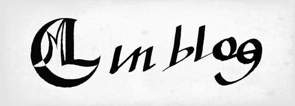
How and Why to Create Unconventional Logos
Nowadays, we are living in a world where everything is at hand and everyone has many possibilities to choose from. From the perspective of the manufacturers, the problem is regarded somehow the other way around: how to get noticed by prospective clients.
In the online medium, the opportunities are even more numerous and it requires a well-thought strategy in order to be distinctive from the crowd. A small element that nevertheless has a pretty important role in the overall success is the logo. Apart from the academic definitions, a logo is the graphical element which represents a company, organization or a product. Apparently, it may be considered worthless, but it says a lot about the represented entity. An unconventional logo, built with rarely seen elements hides the clear message that the owner considers himself and wants to create the image of unusual, new and fresh. Being unique is really important, it attracts people, and it is very clear!
This kind of image is profitable and there are many competitors which are trying to achieve this position. The starting point of the revolutionary strategy of becoming unconventional may be the logo and this article is perfect to reveal some secrets of a noticeable logo.
1. Use a large palette of colors and sometimes even stringent tones

A nice and unique design is eye–catching (definitely a must have feature of a good logo) but many times a cool or a decent color scheme is the one which adds up to the wow effect or simply put it into the shadow. Paradoxically, a very common type of logo which sometimes is turning into a very distinctive one is based on the black and white format. These are very versatile, allowing for the representation of almost every type of corporation or product. Personally, I am amazed by black and white logos and these are clearly timeless.
Another solution is to use a rarely met color combination and this means a great plus for originality, but anytime it can result into a very bad color scheme. Innovation is always risky and unique may be interpreted as insane. On the other hand, the color should be customized to the design of the logo. There isn’t a great vectorial calculus to imagine a vector, the color, which is growing to minus infinite and the shape to plus infinite, the result is zero. In a nutshell, both colors and the shape should have a convergent direction. A logo isn’t a shape, few nuances and a font – it is an entity and the colors must be a catalyst for any person looking at it to quickly understand the message transmitted.
2. Select only rarely used fonts

A logo is usually a small graphic design project and a letter or a word is a small constituent of it. Thinking this way, a font is a negligible entity but in fact it is a serious mistake and the professional logo designers know this situation better.
The use of a proper font is mostly an art and only the talented and/or experienced ones handle the fonts in an unconventional manner. The most well known logos are made with common fonts but to be remarkable it is recommended to avoid them. As I said in the beginning, the Internet is full of opportunities and to select a better font takes a matter of time.
3. Unconventional logos are created from unconventional ideas

Any high quality graphical realization can’t be called an innovative logo without an unconventional idea behind it. This is so simple to say but it’s terribly difficult to put into practice. A good color combination, some attractive fonts can’t guarantee amazing results if the underlying idea is boring. It’s an annoying mental exercise to find the unconventional logo but respecting the laws of beautiful design. Unfortunately, there is no clear recipe on how to make someone capable of realizing an unconventional piece of art.
4. Originality and creativity

In spite of offering no clear advice on making a great design there are two qualities that allow designers to stand apart: originality and creativity. These concepts are almost equivalent; the big difference is that originality is more related to innovation while creativity to efficiency. Anyway, their common factor is the imagination. To really boost your imagination, please enjoy the works below:
Black & White
 db04ec78d979bcf1ddc8d73a7ab8e9e61 How and Why to Create an Unconventional Logo" height="328" width="536">
 ea01d827b93111c4993d27e199b901 How and Why to Create an Unconventional Logo" height="260" width="325">

 cbe80c0643a851def69d36ae9a79152e1 How and Why to Create an Unconventional Logo" height="260" width="325">
 ee87d32fd10dcd005560040ca6086f1 How and Why to Create an Unconventional Logo" height="260" width="325">
Joy of Colors
 cd784c2763d573fb772c0b52e6424241 How and Why to Create an Unconventional Logo" height="328" width="536">
 ba6665aa1fcee02f4f771e04b657fdb1 How and Why to Create an Unconventional Logo" height="260" width="325">
 ccfabe2103109647a2d033fb56736a1 How and Why to Create an Unconventional Logo" height="260" width="325">
 dc287b672c574eff8087faa10f60ccc91 How and Why to Create an Unconventional Logo" height="260" width="325">
 aa680c74369e98086becdf32fdd605d1 How and Why to Create an Unconventional Logo" height="260" width="325">
 aede68c9e2f403cbed7838196f2d41 How and Why to Create an Unconventional Logo" height="260" width="325">
 cbe4af3f3be3eaa3af86e814acf15f3c1 How and Why to Create an Unconventional Logo" height="260" width="325">
 ea0482b4855e9e3b2d17fdd0e9daf8131 How and Why to Create an Unconventional Logo" height="260" width="325">
 caeaea669c5172cad8fbc127d86b01 How and Why to Create an Unconventional Logo" height="260" width="325">
Unconventional Logos
 cb0dfb2c4af649914c48c8c3e66d2e1 How and Why to Create an Unconventional Logo" height="260" width="325">


 fe1c581e18c0fd876bd893c40dd76bd91 How and Why to Create an Unconventional Logo" height="260" width="325">
 fa10a37f510df722adaecc71a9dc80231 How and Why to Create an Unconventional Logo" height="260" width="325">
 bab0eb2f6ca3775e246e635d7face1 How and Why to Create an Unconventional Logo" height="260" width="325">
 dbfe9f01c27b4502926a4b0f7961c0b1 How and Why to Create an Unconventional Logo" height="260" width="325">
 aa4646bc2c2cf26c2310f3f19dcefc1 How and Why to Create an Unconventional Logo" height="260" width="325">
 aa30c87c7b218399c52a426eab3f681 How and Why to Create an Unconventional Logo" height="260" width="325">
 cad08f4f2e296cdd0d6307aeff76b1 How and Why to Create an Unconventional Logo" height="260" width="325">
Article Image Credit: Logo-Grid


