quinta-feira, 26 de abril de 2012

My New Visual Identity

It all started as a simple College project to redesign my visual identity, the brand "myself".

My visual identity had been designed with Minimalism, Elegance and Balance in mind. Its colours were basically grey and green for the logo (to show my young way of being), but only on my portfolio; most of the times the logo would appear in either grey or black. Other elements were the 'L' frames, used when the pages had a white backgroung. These same Ls were used on the cover of my portfolio, but in a different way. My business card was entirely black and white with just basic informations: my name, logo, e-mail and phone number. Made to represent the perfect balance between light and darkness, black and white, Yin and Yang. My young way of being was represented by its different shape.


But when the teacher approached us with this project, I started to realize that this identity didn't really correspond to the image I present people of myself. I am a fun, bright, energetic, contemporary, pop young man. Apart from the green logo and only for its colour, nothing else represented that! So I needed a radical change in redesigning and repositioning my brand!

Starting with our brand positioning, we needed to define it in two words. Mine were BOLD and PERSISTENT. Our design needed to show that without mentioning it with words. I needed to convey these graphically, through colour, logo, and other graphic elements.

First things to change were the colours. What colours represented me the best? Researching for myself and asking other people what colours came immediately to their minds when they thought of me the chosen were orange, yellow and purple. After experimentations in composition, layout and these kind of stuff, I chose purple and yellow. These are energetic, pop, fun colours that do represent my personality today.

Next was the logo. Although I love my LCM logo, it is kinda mystical, antique, HarryPotterish and LordofTheRingsish; and might have represented my personality well ten years ago, when I designed it. But today, although there is still a part of me that this logo does define, it is not the way I show myself to the world, so it needed change. I didn't want to create a new logo like the other one 'cause I didn't completely abandoned it, so I chose to use just my name. But Leonardo wasn't really me, the way I behave, or how I present myself to others. LEO is much more proper, intimate and young. And I wanted to be more than Leo Maino: Graphic Designer; I wanted to show I have more to offer, to show the boldness, quality and difference of my work; show that I have something more in my design that the other designers have. That is a very risky thing, but hey, you need boldness for that, right?

So after several studies with colours, compositions, synonyms, expresisons and ways to put it, it finally came down to this:


'Leo' is well highlighted, but you can notice 'design' right in the center of it. The boldness and fun of the colours are complemented by the slight tilt in the logo. My persistence is shown with the lines maintained from the old visual identity (the Ls) that now have been refined. The + breaks the straight rigid grid of the logo showing that my design breaks stablished paradigms and has something more; its is a Design with a +.

My business card has been remodeled, with this new identity:


And you can see my new portfolio here: belasartes.br/portfolio/lcm

I think this is one of my biggest personal projects if considering how long it took to finish it, having to cope with other college stuff and stuff from the office. But I am happy with the result, it was another successful challenge!


LEO

quinta-feira, 5 de abril de 2012

10000

Sometimes you've got to take a step backward in order to take two steps forward. I truly believe in this saying and that's what is happening in this new phase of my life. So, nothing more appropriate to celebrate my 10000 viewers than a plain drawing, made with pen and paper, like we all learn to do, very early in our lives. No computer vector or fancy 3d stuff. Just simple and perfect sketch. Thank you all ;)

quarta-feira, 28 de março de 2012

Life at the present moment...

Dear people of the world, I've been writing this blog for two years now and what started out as a pastime to end my boredom now consumes more than my life permits me to handle. In order to write really good posts, as I'd like, I would need time to research about each post's subject, and I decided that I am not going to write some crappy thing here just to write something. I write for pleasure, not obligation. And that is why I am writing more rarely, when time and desire let me do so. Time meaning college, work, school projects, personal projects and housekeeping, and desire meaning not wanting to lay down and forget about life when I find some rare spare time to myself.

But today I am showing you a new cover I recently designed for a book called O Alienista by Machado de Assis (translated to The Psychiatrist). The book plot deals with madness and the proposition for this cover was to design something completely conceptual. My design is as follows:


The main idea is unbalance, referring to a mad person as an unballanced person, so the composition was intentionally designed non simetrical and with no equilibrium.
The scribbles mean two things:
1 - the brain cells of a mad person, that are not in their right place;
2 - the mad person excluded from the society, as an alien in its own environment
The title was hand drawn, in the same traces as the scribbles and, the title has no spaces between the article and noun, this all giving a more chaotic and confused feeling to the cover.
The background has a blue-greyish green colour, to give the piece a gaunt-ish feel but allude to the name of the madhouse depicted in the book, which is called "The Green Mansion".

I hope you've enjoyed my new work and that you look forwrd for the next one I show you, even though it might tame a loooong time to publish it here. Now... go enjoy life while I
work a bit more to enjoy mine in the near future! ;)

sábado, 4 de fevereiro de 2012

Yosemite

Yosemite HD from Project Yosemite on Vimeo.

This video is a collaboration between Sheldon Neill and Colin Delehanty. All timelapses were shot on the Canon 5D Mark II with a variety of Canon L and Zeiss CP.2 Lenses.

Project Yosemite Website: http://projectyose.com
Contact info: info@projectyose.com

Thanks to Dynamic Perception for their motion controlled dolly and continued support!

Dynamic Perception Website: http://dynamicperception.com

Track: Outro
Album: Hurry Up, We're Dreaming
Artist: M83
Site: http://ilovem83.com
Publishing: http://emimusicpub.com
Licensing: http://bankrobbermusic.com

This whole project has been an amazing experience. The two of us became friends through Vimeo and explored a shared interest in timelapsing Yosemite National Park over an extended period of time. We'd like to expand this idea to other locations and would appreciate any suggestions for a future project.

Twitter:
https://twitter.com/#!/SheldonNeill
https://twitter.com/#!/barple

Facebook:
http://www.facebook.com/sheldon.neill
http://www.facebook.com/delehanty

Behind The Scenes: http://vimeo.com/35223326
By Dalton Runberg

Our hearts go out to the families of Markus Praxmarer who lost his life while climbing Half Dome on September 19th, 2011 and Ranger Ryan Hiller, who was crushed by a tree January 22nd 2012. They will be missed. (A photo of Ranger Ryan Hiller can be found to the right, above the statistics counter)


fonte: Design Atento

sexta-feira, 6 de janeiro de 2012

2012

Welcome to the first post of the year! I know I have been quite absent and haven't posted cool things frequently, but even on holidays I had work to do. Only one week to rest and now life is back at full speed. I've got lots of new projects to go through this year, and the first is my new identity. It all started as a school project, but even after term has ended I am still working on it, redesigning my "brand". New logo? New typography? New colours? New approach? Believe it, it may seem easier to design your own identity, but it is not! You need to find the balance between all your personas and decide what is the exact image you want to show the world and be able to represent that graphically. But in the near future I will have everything done and explained here on this blog. Untill then... Happy New Year!


Bem-vindos ao primeiro post do ano! Sei que estive meio que ausente e não postado coisas legais frequentemente, mas mesmo nas férias tive trabalho pra fazer. Só uma semaninha de descanço a a vida já está de volta A à toda velocidade. Tenho vários projetos pensados para este ano e o primeiro deles é minha identidade. Tudo começou com um simples trabalho de faculdade, mas mesmo depois do semestre ter acabado, ainda estou trabalhando nele, redesenhando a minha "marca". Novo logo? Nova tipografia? Novas cores? Nova abordagem? Acreditem, pode parecer mais fácil projetar sua própria identidade, mas não é! Você precisa achar o equilíbrio entre todos os seus lados e decidir qual é a imagem que você quer passar para o mundo e ser capaz de representá-la graficamente. Mas no futuro não-tão-distante, tudo vai estar pronto e explicado aqui no blog. Até lá... Feliz Ano Novo!

sexta-feira, 23 de dezembro de 2011

domingo, 4 de dezembro de 2011

Movie Makeup

I love makeup. I think it's incredible how it can transform people's faces. If you're someone hideous or if you're a heck from your night out yesterday, makeup can transform you into a brand new human being! And that happens literally if we're talking about the artistic movie makeup. Today I am gonna show you three examples of that kind of makeup, which fantastically allowed some actors to transform themselves completely.

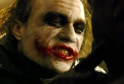
The first one is one of the most talked about and immitated makeups of these past years, the Joker's makeup from The Dark Knight. The Joker from this movie has some scars which give him his "smile" and so, the makeup artist Peter Robb King, along with his team, did several researches in the medical field about real scars in order to make realistic marks on the character. On top of that makeup there's another one, simpler: the clown makeup with pancake and red lipstick. And of course, the characteristic green hair of the character, made to look like a bleached hair gone wrong in this version.

Heath Ledger


The second example is from my beloved Count Olaf, from Lemony Snicket's A Series of Unfortunate Events. Jim Carrey has changed completely for the part of the villain in this movie, with a makeup so well-done that the makeup artists Valli O'Reilly and Bill Corso took home the Oscar and the Saturn Award. Curiously, just like the Joker, the makeup artist had to create another makeup design to go on top of the first (actually two other designs), for when the Count disguises himself to pursue the Baudelaire Orphans "without having his true identity revealed".

Jim Carrey


But the most fantastic makeup of all, and one I find simply perfect, is the one from the mutant Mystique, from X-Men (and from the 2nd movie, the 3rd and also the 4th one). It is so perfect - and no one disagrees - that when they made a new X-Men franchise with a whole new esthetics and design, Mystique's makeup remained the same. Tum Tum! Rebecca Romjin spent 8 to 9 hours a day having silicone prosthetics being applied to her body, and her body entirely painted blue. That was the time during the production of the first movie, but on the second that time went down to "only" 6 hours. It was Gordon J Smith who created Mystique's makeup.

Rebecca Romjin


So my dears, do not underestimate the power of makeup! Use it an abuse it: cover up pimples, be a drag, or make a worthy cinema transformation without fear of being happy!
;)


______


Eu adoro maquiagem. Acho incrível o poder que ela tem de transformar o rosto das pessoas. Se você é uma pessoa horrível ou se está acabada por causa da balada da noite anterior, a maquiagem pode te transformar num ser novinho em folha. E se esse for o caso da maquiagem artística utilizada no cinema, isso acontece literalmente. Hoje vou mostrar três exemplos deste tipo de maquiagem, cujos atores sofreram transformações fantásticas.

O primeiro é uma das maquiagens mais comentadas e copiadas dos últimos anos, a do Coringa do filme Batman - O Cavaleiro das Trevas. O Coringa deste filme possui cicatrizes que dão "o sorriso" à sua aparência, e por isso a equipe, chefiada pelo maquiador Peter Robb King, fez várias pesquisas na área médica sobre a aparência de cicatrizes em casos reais, para poder criar marcas realistas no personagem. Em cima desta maquiagem, há uma outra mais simples, a de palhaço, com pankake e batom vermelho. E é claro, o cabelo verde característico do personagem, que nesta versão é como se fosse um cabelo descolorido que não deu certo.

Heath Ledger


O segundo exemplo é o do meu caro Conde Olaf, do filme Desventuras em Série. Jim Carrey se transformou completamente para o papel vilão do filme, com uma maquiagem tão bem feita que arrebatou o Oscar e o Saturn Award para os maquiadores Valli O'Reilly e Bill Corso. Curioso é que, assim como o Coringa, os maquiadores tiveram que criar uma outra maquiagem em cima da maquiagem (na verdade duas), para as partes que o Conde se disfarça para poder perseguir os Órfãos Baudelaire "sem ter sua identidade revelada".

Jim Carrey


Mas a maquiagem mais fantástica e que eu simplesmente acho per-fei-ta, é a da mutante Mística, do filme X-Men (e do 2, do 3 e do 4 também). É tão perfeita - e ninguém discorda -que, quando fizeram uma nova franquia de filmes dos X-men, com um a nova estética, a maquiagem da Mística permaneceu a mesma! tan tan! Rebecca Romjin passava de 8 a 9 horas por dia sendo maquiada, tendo próteses de silicone coladas ao corpo, e ele inteirinho pintado de azul. Isso para o primeiro filme, para o segundo, o tempo de maquiagem diminuiu para 6 horas. Quem criou a maquiagem foi Gordon J Smith.

Rebecca Romjin

Então meus caros, não subestimem o poder da maquiagem! Usem e abusem: cubram espinhas, se montem inteiros, ou façam uma transformação digna de cinema sem medo de serem felizes.
;)


fontes:
Google Images
IMDB
The Makeup Gallery
A Maquiagem do Coringa: o uso da maquiagem artística para transformações realistas (artigo escrito pela minha própria pessoa)