quinta-feira, 29 de setembro de 2011

Parque Trianon

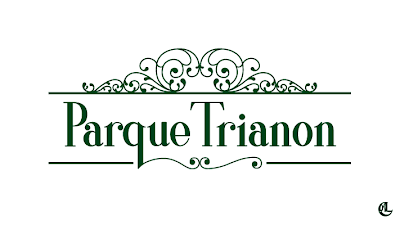
Continuando minha vasculhação por projetos antigos de faculdade, hoje resolvi mostrar pra vocês o logo que fiz para o Parque Trianon, em São Paulo. O projeto era para criar uma nova identidade e toda a sinalização do parque, e junto, vinha a marca. Os conceitos estabelecidos eram o de Elegância, Tradição, e Romantismo (o movimento artístico, não aquela química que há no ar quando dois seres se apaixonam). Fizemos uma pesquisa detalhada de ornamentos e características tipográficas típicas do período Romântico. E acho que a principal palavra que usamos em todo o trabalho foi arabesco. "Porque isso tem que ter arabesco. O arabesco é assim. O arabesco é assado. Arabesco isso, arabesco aquilo. Arabesco, arabesco arabesco!" E quem não sabe o que é arabesco... vai procurar! Enfim; o projeto todo foi desenvolvido em grupo, um grupo de cinco pessoas. Mas o logo final foi desenvolvido por mim, e pela minha cara Yasmin Klein. O logotipo tem tipografia exclusiva desenhada por mim, baseadas nos conceitos e nas características românticas encontradas na pesquisa. Os arabescos foram desenhados pela Yasmin, também em cima das várias pesquisas sobre arabescos e ornamentações do período. "Enjoyem"!


Aqui você pode ver o portfólio da Yasmin Klein, e aqui o flickr dela.

Agora, vamos descansar! :D Sim, descansar porque é só isso que dá pra fazer, já que esqueci todo o material pra fazer trabalho no escritório ¬¬

beijo do leo!
;*


_______


Continuing my ransacking through old college projects, today I decided to show you the logo I made for the Trianon Park, in São Paulo. The goal of the project was to create a new identity for the park and all its signage. Along with it was, of course, the logo. The concepts that we established for the project were Elegance, Tradition, and Romanticism. We made a detailed research of ornaments e typographic characteristics used in the Romantic period (the artistic age okay?, not the time when two beings fall in love). And I think the most used word during our work period was arabesque. "Because this has to have an arabesque. The arabesque this way. The arabesque that way. Arabesque this, arabesque that. Arabesque, arabesque, arabesque!" And for those who do not know what arabesque is... go find out! Anyway; the project was developed by a group of five people. But the final logo was made by myself and my my dear Yasmin Klein. The typography was designed by me exclusively for this project, based on the concepts and on the romantic characteristics discovered on the research. The arabesques were designed by Yasmin, also on the several researches about curlicues and ornamentation of that period.
Enjoy!


Here you will find Yasmin Klein's portfolio, and here her flickr.

Now, let's rest! :D Yes, rest because its all I can do, since I 've forgotten all my homework material at the office ¬¬

kiss from leo!
;*


song: What's My Name, by Rihanna
sexta-feira, 23 de setembro de 2011

Dilma Cruella

Because of a surgery I find myself toothless and with nothing to do. It is a very weird sensation after you spent months working so much and hardly finding time for yourself and suddenly has a whole day to you, and you must stay home and rest, and end up not knowing what to do with all the extra time you got used to not having. So, what did I do? I went ransacking some old (not so old actually) school files and found a project that I made in my digital illustration class, where we had to choose a picture of someone and transform that person into somebody else using Photoshop, but in a cartoon way.
I made our dear president Dilma Rouseff mutate herself into my dear Cruella DeVil! The final result is below ;)


Por causa de uma cirurgia, encontro-me desdentado e sem nada pra fazer. É uma sensação muito estranha, depois de passar meses trabalhando tanto que você mal encontra tempo pra si mesmo e de repente tem o dia todo pra você; e é obrigado a ficar em casa e descansar, e acaba não sabendo o que fazer com todo o tempo livre que se acostumou a não ter. Então, o que eu fiz? Fui vasculhar alguns arquivos velhos (não tão velhos) de faculdade e achei um projeto que fiz na aula de ilustração digital, no qual tínhamos que escolher uma foto de alguém e transformar aquela pessoa em outra, só que de um modo caricaturesco.
Eu fiz nossa querida presidentE (não é presidentA não, tá!) Dilma Rousseff mutar-se na minha querida Cruella DeVil! O resultado final está acima ;)


:B

terça-feira, 20 de setembro de 2011

bobble

Those who know me know that I am a huuuge fan of the Egyptian designer Karim Rashid. I've talked about him more than once ere on the blog. And my favourite design piece made by him is the water bottle Bobble. And now, I finally got one!!!


Bobble is a water bottle made by recycled materials and has a lid that has a filter attached to it. I saw in an interview with Karim once that bobble was designed to help people that have no access to clean water. So you can just fill it with your tap water (although here in São Paulo tap water is potable) and drink clean, healthy water. How great is that?!


Now, besides all that, bobble is beautiful and very well designed. Its shape and colour are very appealing and because of its elliptical diameter depending on where you squeeze its body, more or less water is expelled from it. Aaand, the final touch is on the botom: one of Karim Rashid's symbols is branded there. Details that make a difference.


Its packaging is great also. It's simple and very chic. All in black with a few informational elements in different colours. And it is assembled with only one piece of card stock with special die cut. Very well designed just like the bobble bottle.


Bobble is cheap, is good-looking and eco-friendly. Need any more reasons to buy one? Cause I still got plenty ;)

Bobble's site: waterbobble.com
Karim Rashid's site: KarimRashid.com


_______


Aqueles que me conhecem sabem que eu sou um graaaande fan do designer Egípcio Karim Rashid. Já falei dele mais de uma vez aqui no blog. E minha peça de design favorita feita por ele é a garrafa de água Bobble. E agora eu tenho uma!!!


Bobble é uma garrafa de água feita de materiais recicláveis e possui uma tampa com um filtro acoplado. Eu numa entrevista do Karim, uma vez, que a bobble foi projetada para ajudar pessoas que não possuem acesso à agua limpa. Então você pode simplesmente enchê-la com a água da torneira (se bem que a água de torneira aqui de São Paulo é potável) e beber água limpa e saudável. Quão genial é isso?!


Agora, além de tudo isso, a bobble é linda e muito bem desenhada. Seu formato e cor são muito atrativos e, por causa de seu diâmetro elíptico, dependendo de onde você aperta, mais ou menos água é expelida dela. Eeeee, o toque final está na parte de baixo: um dos símbolos do Karim Rashid está marcado ali. Detalhes que fazem toda a diferença.


Sua embalagem é ótima também. É simples e muito chique. Toda em preto com apenas alguns elementos de informação em cores diferentes. E é montada com apenas uma folha de cartão com faca especial. Muito bem projetada, igual à garrafa.


Bobble é barata, bonita e sustentável. Precisa de alguma outra razão pra comprar uma? Pois eu ainda tenho várias ;)

site da Bobble: waterbobble.com
site do Karim Rashid: KarimRashid.com


fotos: Eu e Google

música: Only Girl, da Rihanna

domingo, 18 de setembro de 2011

Lippincott

GENTE! PÁRA TUDO!!! (brazilian expression of astonishment with a new discovery) One of the agencies that were on my list to show here on the blog is Lippincott. And I have just found out (just now) that it was Lippincott that redesigned the Starbucks logo!!! \O/ And taht is not all: it was Lippincott that established and set the standard for the Coca-Cola brand!! With red and the wave that alludes to the shape of the bottle. And there's even more: there are other important brands in their portfolio such as Chrysler, Delta Airlines, Dell and many others, including the brazilian Vale (that for me it will always be Vale do Rio Doce).


I knew that their works were good, but had no idea of how good they were. I had nothing thought of how I was going to write this post, but I confess that my ansiety and the fact that I discovered Starbucks on their website made me rush to my blog and spread the word to the world. So enjoy the works below and the others on their website: Lippincott - Brand Strategy and Design


I have already talked about Starbucks, brand logo, identity etc. a few other times. If you'd like to see those posts click here, here and here.

Excited kisses from leo
:*


photos:
Lippincott
Google

_______


GENTE! PÁRA TUDO!!! Uma das agências que estava na minha lista para mostrar aqui no blog é a Lippincott. E eu acabei de descobrir (agorinha mesmo) que foi a Lippincott que redesenhou a marca da Starbucks!!! \O/ E não é só isso: foi ela que nos anos 60 estabeleceu e padronizou a marca da Coca-Cola!! Com vermelho e a onda alusiva ao formato da garrafa! E não pára por aí: no seu portfólio há outras marcas de peso, como Chrysler, Delta Airlines, Dell e muitas outras, incluindo a brasileira Vale (que pra mim vai continuar sendo Vale do Rio Doce pra sempre).


Eu sabia que os trabalhos eram bons, mas não tinha ideia do quanto. Nem tinha pensado no que ia escrever, mas confesso que minha ansiedade e o fato de ter descoberto a Starbucks no site deles me fez correr para o blog e espalhar para o mundo! Então aproveitem os trabalhos abaixo e vejam os outros no site deles: Lippincott - Brand Strategy and Design


Eu já falei sobre a Starbucks, marca, logo, identidade etc. algumas outras vezes. Se você quiser ver estes posts clique aqui, aqui e aqui.

Beijos animados do leo
:*


fotos:
Lippincot
Google

música: The Golden Age, do The Asteroids Galaxy Tour

sexta-feira, 16 de setembro de 2011

Wolff Olins

Another excellent Design Agency is Wolff Olins. If you do not know who they are, I bet you've at least seen one of their works. As they say, they are a brand business and work strategically with ambitious organizations worldwide. To better understand what Wolff Olins is about, watch this fun little about them: Wolff Olins Revised

Great aren't they? Amongst the most known pieces by them are the Aol and Tate redesigns, and the London 2012 Olympic Games visual identity. And I keep surprising myself to find out how many visual identities and communication of brazilian brands were designed overseas, and Wolff Olins is one of the studios that have done so. In this case with the mobile phone company Oi. But my favourite of all their work, and one of the logos I like the most ever since I started studying design is the Unilever logo. It is excellent in demonstrating exactly what Unilever is, a huge owner of quality brands worldwide. Don't you just wish you could have designed that?


sources:
Wolff Olins
Google
abcDesign


_______


Outra excelente agência de Design é a Wolff Olins. Se você não sabe quem são, tenho certeza que pelo menos um de seus trabalhos você já viu. Como eles dizem, são um negócio de marcas e trabalham estrategicamente com organizações ambiciosas do mundo todo. Para entender melhor do que se trata a Wolff Olins, veja esse videozinho legal: Wolff Olins Revised

Ótimos, não? Entre os trabalhos mais conhecidos estão o redesign da Aol e dos museus Tate, e a identidade visual dos Jogos Olímpicos de Londres 2012. E continuo me surpreendendo que muitas identidades e comunicações visuais de marcas brasileiras são feitas lá fora, e a Wolff Olins é um dos estúdios que fez isso. Neste caso com a companhia de celulares Oi. Mas o meu favorito trabalho deles, e um dos logos que que eu mais gosto desde que comecei a estudar design, é o logo da Unilever. Excelente em demonstrar exatamente o que a Unilever é, uma gigante dona de marcas de qualidade mundo afora. Não te dá uma vontade de ter projetado esse logo?


fontes:
Wolff Olins
Google
abcDesign


música: Someone Like You, da Adele

quarta-feira, 14 de setembro de 2011

Interbrand

Continuing my list of great Design studios, now I am going to talk about Interbrand. I discovered Interbrand through my Marketing teacher, who mentioned it to me one day. Then, as usual, I went researching to find out more about it and here's what I've found out:

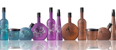
It was Interbrand who made one of the most beautiful packaging designs I've ever seen, the Éh line. The products are great (tested by myself when I bleached my hair and I had to do something about the straw-like texture it had acquired) and both graphic and structural designs of the line's packages manage to show that.


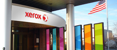
It was Interbrand who managed to update Xerox's visual identity to match the company's technological evolution. Before, its identity had been the same for decades, while its position had changed a lot, offering a whole more range of services beyond just copier solutions.


And it was Interbrand who repositioned McDonald's, helped the chain's sales grow in the global market and made everyone sing that they're loving it. Ba da ba ba ba!


These are only three of Interbrand's works, to view more, visit their website.

Untill next post...

;*

_______


Continuando minha lista de ótimos estúdios de Design, agora vou falar sobre a Interbrand. Descobri a Interbrand através da minha cara professora de Marketing, que mencionou a agência pra mim um dia. Então, como sempre, fui pesquisar mais sobre o estúdio e cá está o que descobri:

Foi a Interbrand que criou um dos designs de embalagens mais bonitos que já vi, a linha Éh. Os produtos são ótimos (testados pela minha pessoa quando descolori o cabelo e tinha que fazer alguma coisa em relação à textura de palha que ele adquiriu) e ambos os projetos gráfico e estrutural conseguem mostrar tal qualidade.


Foi a Interbrand que conseguiu atualizar a identidade visual da Xerox para igualá-la à evolução tecnológica da companhia. Antes sua identidade tinha sido a mesma por décadas enquanto seu posicionamento tinha mudado muito, passando a oferecer uma gama de serviços muito além de apenas cópias.


E foi a Interbrand que reposicionou o McDonald', ajudou as vendas da cadeia a crescerem no mercado global e fez com que todo mundo cantasse que ama muito tudo isso. Pa ra pa pa pa!


Estes são apenas três dos trabalhos da Interbrand. Para ver mais, visite seu site.

Ate o próximo post...
:*

sábado, 10 de setembro de 2011

Pentagram

Since I started the graphic Design course at college, I've heard the name Pentagram from time to time, but it took me some time to really get to know it's meaning. I am not talking about the geometrical shape, I am talking about the world-known design studio. I was at work one day and heard the name Alan Fletcher. I knew it meant something but didn't know what. So I went for a research and I found out. Alan Fletcher was one of the designers who founded Pentagram (amongst other achievements in design), and now it is, as they say in their website, "the world's largest independent design consultancy".

There are some design studios that I like to comment about and show their work on this blog, some I already did, and some I didn't, but will most certainly do in the future. All of them have great portfolios and are places where I'd like to work. Today its Pentagram's turn:


And can you imagine my astonishment to find out I had in my own home a piece of Pentagram's work. Yes my friends, the calendar above is in my possession muahahaha! (evil laugh)

More about Pentagram, and its excellent works on their website.

design kisses for you!
;*


The calendar. Tum tum tuuum!


_______


Desde que comecei a faculdade the design gráfico ouvi o nome Pentagram algumas vezes, mas demorou para realmente saber o seu significado. Nao estou falando do pentagrama, forma geométrica, mas do estúdio de design conhecido mundialmente. Estava no trabalho um dia e ouvi o nome Alan Fletcher. Eu sabia que ele significava alguma coisa, mas não sabia o quê. Então fui pesquisar e descobri. Alan Fletcher foi um dos designer que fundou a Pentagram (entre outros feitos no Design) que agora é, como dizem no próprio site do estúdio, "a maior consultoria independente de design do mundo".

Há alguns estúdios de design sobre os quais gosto de comentar e mostrar seus trabalhos aqui no blog; alguns já o fiz, outro ainda não, mas certamente o farei. Todos eles tem ótimos portfólios e são lugares em que eu gostaria de trabalhar. Hoje é a vez da Pentagram.


E vocês podem imaginar minha perplexidade quando descobri que tinha em minha própria casa um pedaço do trabalho da Pentagram. Sim, meus caros, o calendário acima está em minha posse muahahahaha! (risada maléfica)

Mais sobre a Pentagram, e seus excelentes trabalhos no seu site.

beijos designísticos pra vocês!
;*


O calendário. Tan tan taaaaaan


música: LDN, da Lily Allen