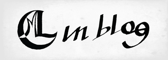
My visual identity had been designed with Minimalism, Elegance and Balance in mind. Its colours were basically grey and green for the logo (to show my young way of being), but only on my portfolio; most of the times the logo would appear in either grey or black. Other elements were the 'L' frames, used when the pages had a white backgroung. These same Ls were used on the cover of my portfolio, but in a different way. My business card was entirely black and white with just basic informations: my name, logo, e-mail and phone number. Made to represent the perfect balance between light and darkness, black and white, Yin and Yang. My young way of being was represented by its different shape.
But when the teacher approached us with this project, I started to realize that this identity didn't really correspond to the image I present people of myself. I am a fun, bright, energetic, contemporary, pop young man. Apart from the green logo and only for its colour, nothing else represented that! So I needed a radical change in redesigning and repositioning my brand!
Starting with our brand positioning, we needed to define it in two words. Mine were BOLD and PERSISTENT. Our design needed to show that without mentioning it with words. I needed to convey these graphically, through colour, logo, and other graphic elements.
First things to change were the colours. What colours represented me the best? Researching for myself and asking other people what colours came immediately to their minds when they thought of me the chosen were orange, yellow and purple. After experimentations in composition, layout and these kind of stuff, I chose purple and yellow. These are energetic, pop, fun colours that do represent my personality today.
Next was the logo. Although I love my LCM logo, it is kinda mystical, antique, HarryPotterish and LordofTheRingsish; and might have represented my personality well ten years ago, when I designed it. But today, although there is still a part of me that this logo does define, it is not the way I show myself to the world, so it needed change. I didn't want to create a new logo like the other one 'cause I didn't completely abandoned it, so I chose to use just my name. But Leonardo wasn't really me, the way I behave, or how I present myself to others. LEO is much more proper, intimate and young. And I wanted to be more than Leo Maino: Graphic Designer; I wanted to show I have more to offer, to show the boldness, quality and difference of my work; show that I have something more in my design that the other designers have. That is a very risky thing, but hey, you need boldness for that, right?
So after several studies with colours, compositions, synonyms, expresisons and ways to put it, it finally came down to this:
'Leo' is well highlighted, but you can notice 'design' right in the center of it. The boldness and fun of the colours are complemented by the slight tilt in the logo. My persistence is shown with the lines maintained from the old visual identity (the Ls) that now have been refined. The + breaks the straight rigid grid of the logo showing that my design breaks stablished paradigms and has something more; its is a Design with a +.
And you can see my new portfolio here: belasartes.br/portfolio/lcm
I think this is one of my biggest personal projects if considering how long it took to finish it, having to cope with other college stuff and stuff from the office. But I am happy with the result, it was another successful challenge!
LEO


