
Aqui você pode ver o portfólio da Yasmin Klein, e aqui o flickr dela.
Agora, vamos descansar! :D Sim, descansar porque é só isso que dá pra fazer, já que esqueci todo o material pra fazer trabalho no escritório ¬¬
beijo do leo!
;*
_______
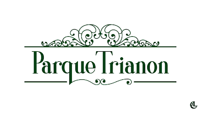
Continuing my ransacking through old college projects, today I decided to show you the logo I made for the Trianon Park, in São Paulo. The goal of the project was to create a new identity for the park and all its signage. Along with it was, of course, the logo. The concepts that we established for the project were Elegance, Tradition, and Romanticism. We made a detailed research of ornaments e typographic characteristics used in the Romantic period (the artistic age okay?, not the time when two beings fall in love). And I think the most used word during our work period was arabesque. "Because this has to have an arabesque. The arabesque this way. The arabesque that way. Arabesque this, arabesque that. Arabesque, arabesque, arabesque!" And for those who do not know what arabesque is... go find out! Anyway; the project was developed by a group of five people. But the final logo was made by myself and my my dear Yasmin Klein. The typography was designed by me exclusively for this project, based on the concepts and on the romantic characteristics discovered on the research. The arabesques were designed by Yasmin, also on the several researches about curlicues and ornamentation of that period.
Enjoy!
Here you will find Yasmin Klein's portfolio, and here her flickr.
Now, let's rest! :D Yes, rest because its all I can do, since I 've forgotten all my homework material at the office ¬¬
kiss from leo!
;*
Enjoy!
Here you will find Yasmin Klein's portfolio, and here her flickr.
Now, let's rest! :D Yes, rest because its all I can do, since I 've forgotten all my homework material at the office ¬¬
kiss from leo!
;*
song: What's My Name, by Rihanna


Nenhum comentário:
Postar um comentário